Colour Theory for Screens (Not Art School)
The colour theory you learned in school was about paint. Red and blue make purple. Primary colours are red, yellow, and blue. Complementary colours sit opposite each other on the wheel. That knowledge is useful for understanding relationships between hues, but it tells you almost nothing about how colour works on a screen, which is where every website you'll ever design will be viewed.
Digital colour operates by completely different rules. Understanding those rules won't just make you better at choosing palettes. It'll help you solve the practical problems that trip up experienced designers: why a colour looks different on two monitors, why a client says “that's not the red I meant," why your beautiful gradient has an ugly muddy band in the middle, and why your perfectly chosen brand colour fails an accessibility audit.
Additive vs. Subtractive Colour
Paint mixes subtractively. Each pigment absorbs (subtracts) certain wavelengths of light and reflects the rest. Mix all pigments together and you get a dark muddy brown approaching black, because nearly all wavelengths are absorbed.
Screens work additively. Each pixel emits light in three channels: red, green, and blue (RGB). Mix all three at full intensity and you get white, because all wavelengths are present. This is why the primary colours on screen are red, green, and blue rather than the red, yellow, and blue of paint mixing.
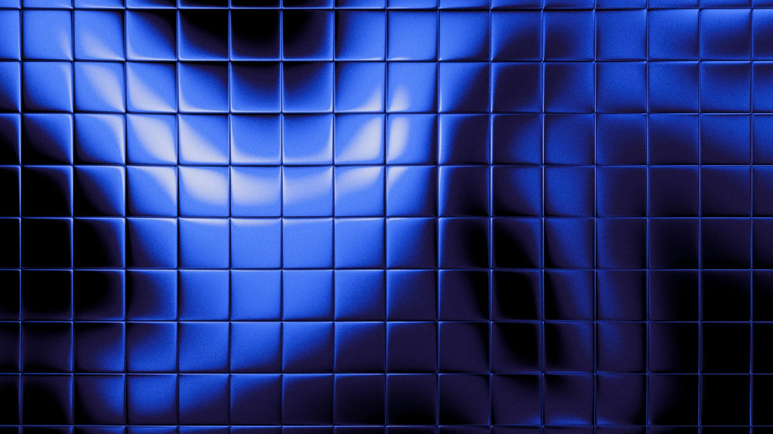
This distinction matters practically because colour intuitions developed from physical media don't always apply on screen. "Mixing" orange and blue in paint gives you a muted olive. Placing orange (#FF8C00) next to blue (#0047AB) on screen creates a contrast that's more vibrant than any paint equivalent, because both colours are emitting light rather than absorbing it. The emotional and perceptual impact of colour on screen is more intense than in print, which means subtlety is harder to achieve and restraint becomes more important.
Colour Spaces and Why Your Red Isn't Their Red
When you specify a colour in Squarespace as #E74C3C, you're specifying an sRGB value. sRGB (standard Red Green Blue) is the default colour space of the web, and it defines a specific range (gamut) of colours that can be displayed.
The problem is that sRGB was defined in 1996 and represents a relatively narrow range of the colours human eyes can perceive. Modern displays, particularly Apple's Retina screens and high-end monitors, support wider colour spaces like Display P3, which can show approximately 25% more colours than sRGB. This means a vibrant red that looks rich and saturated on a P3 display will look slightly duller on an sRGB monitor, because the sRGB monitor literally cannot produce that colour and substitutes the closest available match.
For most web design work, this difference is subtle enough to ignore. But if your client's brand relies on a very specific, very saturated colour (think Coca-Cola red or Cadbury purple), it's worth knowing that the colour will not look identical on every screen. It will look close, but not identical, and there's nothing you or Squarespace can do about it. Setting expectations with clients on this point can prevent unnecessary revision cycles where they're comparing your desktop preview with their phone and asking why it's “not quite right."
CSS now supports the color() function with the display-p3 colour space, allowing you to specify wider-gamut colours for displays that support them with an sRGB fallback for those that don't:
.accent-element {
  /* sRGB fallback */
  color: #E74C3C;
  /* P3 for capable displays */
  color: color(display-p3 0.91 0.30 0.24);
}
Squarespace's colour picker uses hex (sRGB) exclusively, so wider-gamut colours require custom CSS.
HSL: A Better Way to Think About Colour
Most designers work in hex (#E74C3C) or RGB (231, 76, 60), both of which describe colour in terms of channel values. These formats are precise but unintuitive. Looking at #2C3E50, can you tell what colour that is? (It's a dark blue-grey.) Can you tell how to make it 20% lighter? (You'd need to increase all three channel values by different amounts, and getting the proportions right by mental arithmetic is essentially impossible.)
HSL (Hue, Saturation, Lightness) describes colour in terms that map to how humans actually perceive colour. Hue is the position on the colour wheel (0 is red, 120 is green, 240 is blue). Saturation is how vivid the colour is (0% is grey, 100% is fully saturated). Lightness is how bright the colour is (0% is black, 100% is white, 50% is the "pure" colour).
Working in HSL makes colour manipulation intuitive. Want to make a colour lighter? Increase the lightness value. Want to desaturate it for a muted palette? Decrease saturation. Want to create a complementary colour? Add 180 to the hue. Want to create an analogous palette? Add and subtract 30 from the hue.
In CSS (and therefore in Squarespace custom code), HSL is fully supported:
:root {
  --brand-primary: hsl(210, 50%, 30%);
  --brand-light: hsl(210, 50%, 70%);
  --brand-muted: hsl(210, 20%, 30%);
}
All three of those colours are based on the same hue (210, a blue), but they differ in saturation and lightness, creating a cohesive family that inherently works together.
Building Palettes That Work
A functional web palette needs more than a pretty set of swatches. It needs specific colours for specific purposes, and the relationships between those colours need to serve the design's communication goals.
At minimum, you need a primary brand colour, a secondary or accent colour, a background colour, a text colour, and a set of functional colours (success/green, warning/amber, error/red, info/blue). You also need tints and shades of your primary and secondary colours for hover states, borders, subtle backgrounds, and disabled states.
The most reliable method for generating tints and shades is to work in HSL and adjust only the lightness value while keeping hue and saturation constant. Starting from your primary colour at, say, HSL(210, 60%, 45%), you can generate a scale: 95% lightness (near-white tint for backgrounds), 85% (subtle tint for alternating sections), 70% (light variant for hover states), 45% (the primary colour itself), 30% (darker variant for active states), 15% (near-black shade for text).
This approach guarantees that every colour in the scale is harmonically related to the primary, because they share the same hue and saturation. The result feels deliberate and unified in a way that picking individual colours by eye never quite achieves.
Contrast and Accessibility
WCAG 2.2 requires a minimum contrast ratio of 4.5:1 for normal text and 3:1 for large text (18px and above, or 14px bold and above). These aren't aspirational guidelines. They're requirements that affect legal compliance in many jurisdictions, particularly since the European Accessibility Act took effect in June 2025.
Contrast ratio is calculated by comparing the relative luminance of the foreground colour against the background colour. A contrast ratio of 1:1 means the colours are identical (no contrast). A ratio of 21:1 is the maximum (black on white). The 4.5:1 threshold ensures that text is readable for people with moderately low vision, which includes a significant portion of the population, particularly in the over-40 demographic.
The practical implication for Squarespace designers is that many popular design choices fail accessibility requirements. Light grey text on a white background, a common “elegant" choice, frequently falls below 4.5:1. White text on a bright brand-colour background often fails too, particularly with mid-tone colours like orange, green, and light blue. Even some dark-on-dark combinations in dark mode designs can fall short.
Check every text-background combination using a contrast checker (WebAIM's contrast checker is the standard tool). Do this during the design phase, not after the site is built. Discovering that your client's brand colour doesn't meet contrast requirements when the site is nearly finished is an expensive problem. Discovering it at the palette stage is a minor adjustment.
If a brand colour fails at 4.5:1 against white, you have several options. Darken the colour slightly until it passes (often a shift of 10 to 15% lightness is enough). Use the colour for decorative elements (which don't have contrast requirements) rather than text. Place text in the colour on a darker or lighter background that provides sufficient contrast. Or use the colour at larger sizes where the 3:1 requirement applies instead of 4.5:1.
Colour and Perception
Colour perception is not objective. It's influenced by surrounding colours, ambient lighting, display calibration, and individual visual physiology. Two practical implications of this are worth knowing.
The first is simultaneous contrast. A medium grey square looks lighter on a dark background and darker on a light background. The grey hasn't changed; the surrounding context has shifted your perception. This means a colour that looks perfect in your design mockup on a white artboard may look subtly different on the actual site, where it's surrounded by other colours, images, and content. Always evaluate colours in context, on the live site or a realistic preview, not in isolation on a swatch.
The second is colour constancy limitations on screen. In the physical world, your brain adjusts for lighting conditions (a white piece of paper looks "white" whether you're indoors or outdoors, even though the actual light wavelengths reaching your eye are very different). On screen, this adjustment is weaker because the display is itself a light source. This is why colours that looked right when you designed the site in your well-lit studio may look wrong to a client viewing the site on a dim phone screen in a dark room. You can't control this, but you can design with it in mind by avoiding colours that depend on precise perception to work (very subtle differences between adjacent shades, for instance).
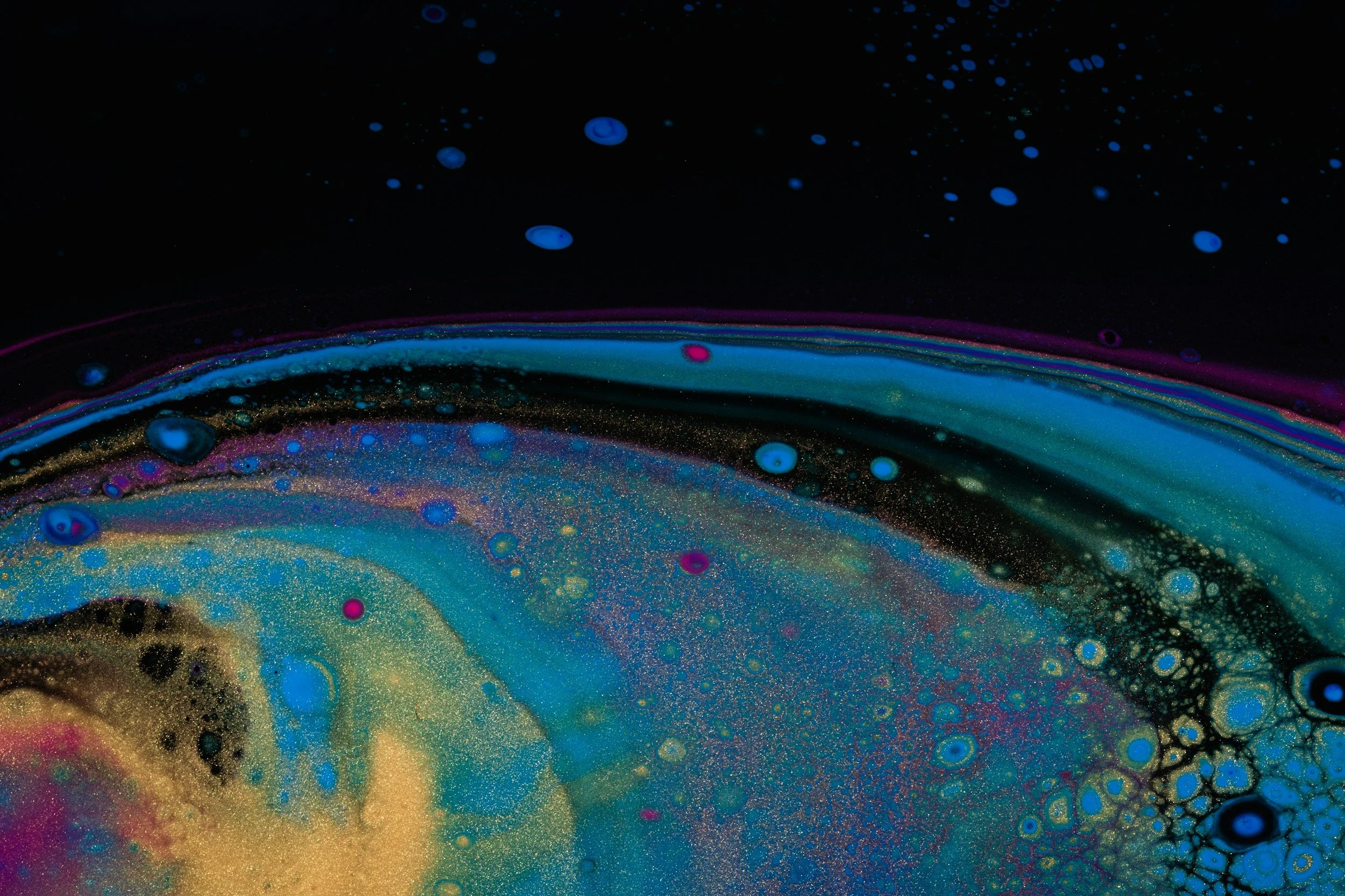
Gradients Without the Muddy Middle
CSS gradients interpolate between two colours in a straight line through colour space. In sRGB (the default), this interpolation can pass through an unexpected desaturated zone in the middle, creating a muddy or grey band. This is most visible in gradients between complementary colours (like blue to orange) or between highly saturated colours with different hues.
The cause is that the sRGB colour space is perceptually non-uniform. The mathematical midpoint between two sRGB values isn't always the perceptual midpoint. Blue (#0000FF) to yellow (#FFFF00) in sRGB passes through a greyish green that doesn't appear in either endpoint.
The fix is to use the oklch colour space for gradient interpolation, which is perceptually uniform and maintains saturation throughout the gradient:
.gradient-section {
  background: linear-gradient(
    in oklch,
    hsl(220, 80%, 50%),
    hsl(40, 90%, 55%)
  );
}
The in oklch modifier tells the browser to interpolate in the OKLCH colour space rather than sRGB, producing a gradient that stays vibrant through the transition. Browser support for this is strong in 2026, covering all modern browsers.
Colour Systems in Practice
The strongest Squarespace sites use colour systematically rather than decoratively. Every colour in the palette has a defined role, and no colour appears without a reason.
Define your colours as CSS custom properties and use them consistently throughout your custom CSS. This creates a single source of truth that makes site-wide colour changes trivial and ensures consistency across every page and section:
:root {
  --color-bg: hsl(0, 0%, 100%);
  --color-text: hsl(210, 20%, 15%);
  --color-primary: hsl(210, 60%, 45%);
  --color-primary-light: hsl(210, 60%, 92%);
  --color-accent: hsl(15, 80%, 55%);
  --color-border: hsl(210, 10%, 85%);
  --color-success: hsl(145, 60%, 40%);
  --color-error: hsl(0, 70%, 50%);
}
When a client asks to "make the blue a bit warmer," you change one value (the hue in --color-primary from 210 to 200) and every element using that variable updates simultaneously. No find-and-replace, no missed instances, no inconsistency.
Colour on screen is physics, perception, and mathematics. Understanding all three won't make you an artist. But it will make you a designer who can build palettes that work everywhere, pass accessibility requirements, and hold together as a system rather than a collection of nice-looking swatches.
Related Articles


