The Client Who Wanted “Something Like Apple"late
Three words that make every web designer's eye twitch.
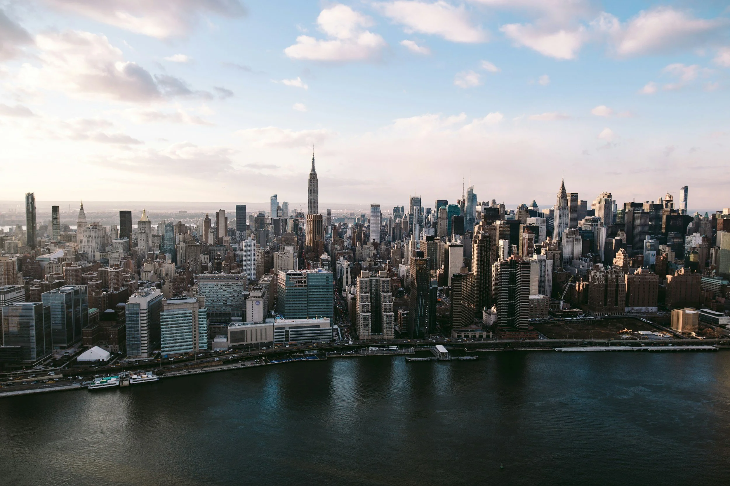
It happened to me on a Tuesday. The brief arrived as a voice note (already a red flag) from a client who ran a small candle business in Somerset. Lovely woman. Lovely candles. Annual revenue somewhere south of £40,000. She'd been on the Apple website over the weekend, and she wanted her candle shop to feel “exactly like that, but for candles."
I did what every experienced designer does in this situation. I said “absolutely, let's explore that" while silently calculating how to close the gap between a £200 million marketing budget and a Squarespace Business plan.
But here's the thing. That conversation, which I've had in some variation at least thirty times, isn't actually about Apple. It's about something the client can feel but can't articulate. And if you dismiss the request instead of decoding it, you miss an opportunity to build something genuinely impressive.
What Apple's Site Actually Does
Before you can redirect the conversation, you need to understand why apple.com feels the way it feels. Most designers think it's about minimalism. It isn't. Apple's site is deceptively complex. Let's break down what's actually happening.
The visual simplicity is achieved through extreme content discipline. Each product page focuses on one thing. One product. One message. One journey from interest to purchase. There are no sidebars, no “you might also like" distractions, no competing calls to action. The page does one job, and every element on it serves that job.
The photography is shot specifically for the web, at resolutions and aspect ratios optimised for how it will be displayed. The hero images aren't photographs that happened to look good. They're planned, art-directed compositions designed for specific viewport widths, with alternative crops for mobile. The budget for a single Apple product shoot would fund our candle client's entire web presence for a decade.
The animations are choreographed to the scroll position, with hardware-accelerated transforms, custom easing curves, and frame-by-frame sequencing that requires dedicated front-end engineers working in WebGL and Canvas. These aren't CSS transitions. They're essentially interactive films.
The typography uses San Francisco, Apple's custom typeface, which was designed from scratch for screen rendering across their entire ecosystem. The type scale, spacing, and sizing have been tested across every Apple device at every resolution.
And the white space. The space between elements on apple.com isn't empty. It's engineered. Every pixel of margin, padding, and gap has been tested against user attention data to determine the optimal visual breathing room.
So when a client says “I want something like Apple," they're responding to the combined effect of world-class photography, custom engineering, bespoke typography, and years of iterative refinement. They can't have that. But they can have the principles behind it, translated to a Squarespace build at a realistic budget.
Decoding What They Actually Want
In my experience, “something like Apple" usually means some combination of these things:
"I want my site to feel premium." This is about spacing, image quality, and restraint. You can achieve this on Squarespace by increasing section padding (most designers use too little), using fewer elements per section, and ensuring every image is professionally shot or carefully curated. A section with one beautiful image, one short heading, and generous white space feels more premium than a section crammed with three images, a paragraph, a testimonial, and two buttons.
“I want it to feel modern." This usually means clean typography, subtle animation, and a preference for flat or minimal UI elements. On Squarespace, this translates to a restrained colour palette (two or three colours maximum), a modern font pairing, and using the platform's built-in animation options sparingly rather than everywhere.
“I want people to take it seriously." This is about consistency and polish. Every page following the same visual rules. No orphaned headings. No inconsistent spacing. No images that are clearly different qualities or styles. The difference between "professional" and "amateur" on the web is almost entirely about consistency.
“I want that scrolling thing." They mean scroll-triggered animation. They've seen content fade in, images parallax, and elements move as you scroll. Squarespace supports basic scroll animations natively (fade in, slide in, scale up), and these, used sparingly, can give a site a more dynamic, modern feel. The key word is sparingly. Apple uses scroll animation on maybe 20% of their content. Most designers who try to emulate Apple apply it to 100%.
The White Space Conversation
This is where the real design education happens, because most clients are instinctively terrified of white space. They've paid for a website, and they want every pixel working. Empty space feels like waste.
The metaphor I use: imagine walking into two shops. The first has products piled on every surface, signs covering every wall, music playing, a TV running in the corner, and a scented candle burning (ironically). The second has ten products displayed on individual shelves, soft lighting, and silence. Which one feels more expensive?
White space doesn't mean empty. It means everything on the page has room to breathe, and nothing is competing for attention. In practical Squarespace terms, this means:
Section padding of at least 80px top and bottom (many designers default to 40px or less). Fewer blocks per section, with each one given generous margins. Text columns that don't stretch to the full section width. Images that aren't crammed edge-to-edge unless that's a deliberate full-bleed choice. And, critically, being willing to cut content. Every element you remove from a page makes the remaining elements more prominent.
The most powerful design tool on Squarespace isn't a block or a feature. It's the delete key.
Photography Makes or Breaks Everything
This is the truth that no amount of design skill can overcome: a beautiful layout with mediocre photographs will always look worse than a mediocre layout with beautiful photographs.
Apple's site looks the way it does primarily because of the photography. Strip out the images and replace them with average stock photos, and the site would look like any other tech company's placeholder page. The design supports the photography, not the other way around.
For Squarespace clients, this means the photography conversation needs to happen early, before design begins. If the client's budget doesn't include professional photography, you need to plan for that. Options include: hiring a photographer (the single best investment a small business can make in their web presence), using high-quality stock photography with a consistent style (one source, one colour temperature, one aesthetic), using illustration or graphic elements instead of photography, or designing sections that don't rely on images at all (bold typography, colour blocks, pattern backgrounds).
What you cannot do is build a design that depends on great photography and then fill it with iPhone snapshots of products on a kitchen table. The layout might be beautiful. The spacing might be perfect. The typography might be exquisite. But the first thing every visitor sees is the photography, and if it's not up to standard, nothing else matters.
Motion and Restraint
The other thing clients notice on Apple's site is movement. Things animate. Content appears. Images transition. It feels alive.
Squarespace's native animation options are limited but effective: blocks can fade in, slide in from a direction, or scale up as they enter the viewport. These are triggered by scrolling and apply to individual blocks.
The rules for using these well:
Use the same animation throughout. If your first section fades in from the bottom, every animated section should fade in from the bottom. Mixing fade-ins with slide-lefts and scale-ups creates visual chaos. Consistency makes animation feel intentional rather than decorative.
Don't animate everything. If every block on the page animates on scroll, the effect becomes noise. Animate the elements you want to draw attention to: key headings, feature images, calls to action. Leave supporting content (body text, secondary images, background elements) static.
Keep durations short. The default animation speed on most platforms is slower than it should be. A 0.3 to 0.5 second duration feels snappy and modern. A 1.5 second duration feels sluggish. If a visitor is scrolling at a normal pace, they shouldn't have to wait for an animation to finish before the content is readable.
And never, under any circumstances, use animation that prevents or delays access to content. An animation is decoration. Content is the product. If the decoration is slowing down access to the product, it's failing.
The Real Lesson
Here's what I eventually told my candle client, and what I tell every client who shows me a reference site with a budget ten thousand times their own:
You can't have Apple's website. But you can have what Apple's website does well, which is focus. One message per page. One action per section. Room to breathe. Beautiful images. No clutter. No compromise on quality, even if that means less content rather than more.
On Squarespace, with a realistic budget, you can build a site that makes someone feel the way Apple's site makes them feel. Not by copying the animations or the layout or the typography, but by applying the same discipline: decide what matters, remove everything that doesn't, and give what remains the space and quality it deserves.
She ended up with a five-page site. Big, gorgeous product photographs (shot by a local photographer friend for the cost of a case of candles and a Sunday afternoon). Minimal text. Loads of white space. No scroll animations at all, because the images didn't need them.
It looked nothing like Apple. And every single person who saw it said it looked expensive.
That's the brief, decoded.
Related Articles